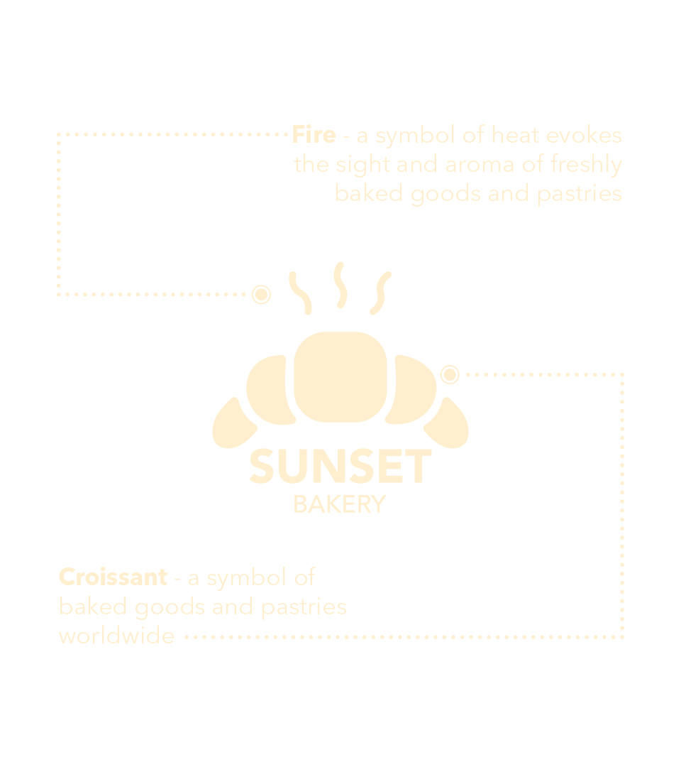
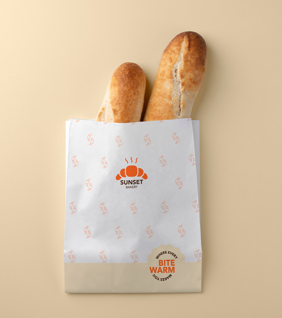
Croissants have become a symbol of baked goods and pastries worldwide. They are instantly recognizable and associated with quality and indulgence. This recognition factor makes the logo easily relatable to potential customers, drawing them in with the promise of delicious treats. At the same time, with the “Sunset Bakery” name, the logo is inspired by the shape of a croissant, like half of the sun setting down, which best describes the brand name.
Combining a symbol of heat, the sight and aroma of freshly baked croissants evoke feelings of warmth and comfort. It’s as if they offer a hug to your senses. In the logo, the croissant symbolizes the bakery’s commitment to providing not just food but a sense of comfort and a welcoming atmosphere.